An important part of forecasting is taking a look at what actually happened, and comparing that to what was forecast. By doing this, we can learn from our mistakes, and hopefully improve our forecasts. I also think it is important for our readers to understand the limitations of weather forecasting, and to be honest about how we're doing. So how accurate were our race forecasts in 2015?
I looked back at our forecasts for 12 races from the 2015 season, and compared our forecasts to observations.
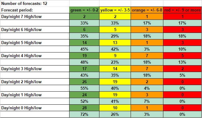
First, let's look at our temperature forecasts. The colored columns show how far off our forecast temperatures were from observations. These include both low and high temperatures. The numbers in the columns tell how many times our temperature forecast fell into those color ranges. The rows are forecast periods - how far in advance from a certain day the forecast is being made. So the Day/night 7 row represents forecasts that are made 7 days in advance. The Day/night 0 row is for forecasts that were posted on the same day as the observation. The percent in each column shows what percent of forecasts for that period fell into each color range. So for all forecasts 4 days in advance, there were 19 times when our temperature forecast was within 2 degrees or less of the observed temperature, which is 48% of all Day 4 forecasts.
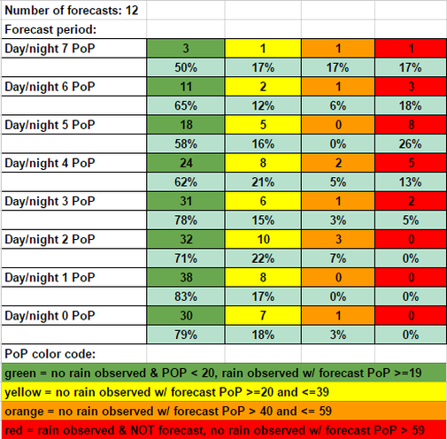
Here's a look at our Probability of Precipitation (PoP) forecasts. For an explanation of what PoP means, see this post. A PoP forecast of less than 20% is considered a dry forecast.
The PoP color code at the bottom explains what the colored columns mean. As was the case with temperatures, the longer-range forecasts were less accurate than the shorter-range forecasts. It appears that our precipitation forecasts jumped in accuracy once we reached 3 days out, with 78% of our forecasts being correct.
Some days are like this:


